Introduction
Websites are accessed using phones, tablets, laptops, and large screens. The devices work in different ways. Screen size differs from one device to another. Input methods also differ across devices. Expectations vary on how a site should appear or function. A responsive website offers a remedy by running smoothly on all devices without hitches. This article offers guidelines on how to create a responsive site.
Responsive Website: What Does It Mean to Have One?
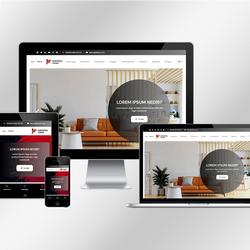
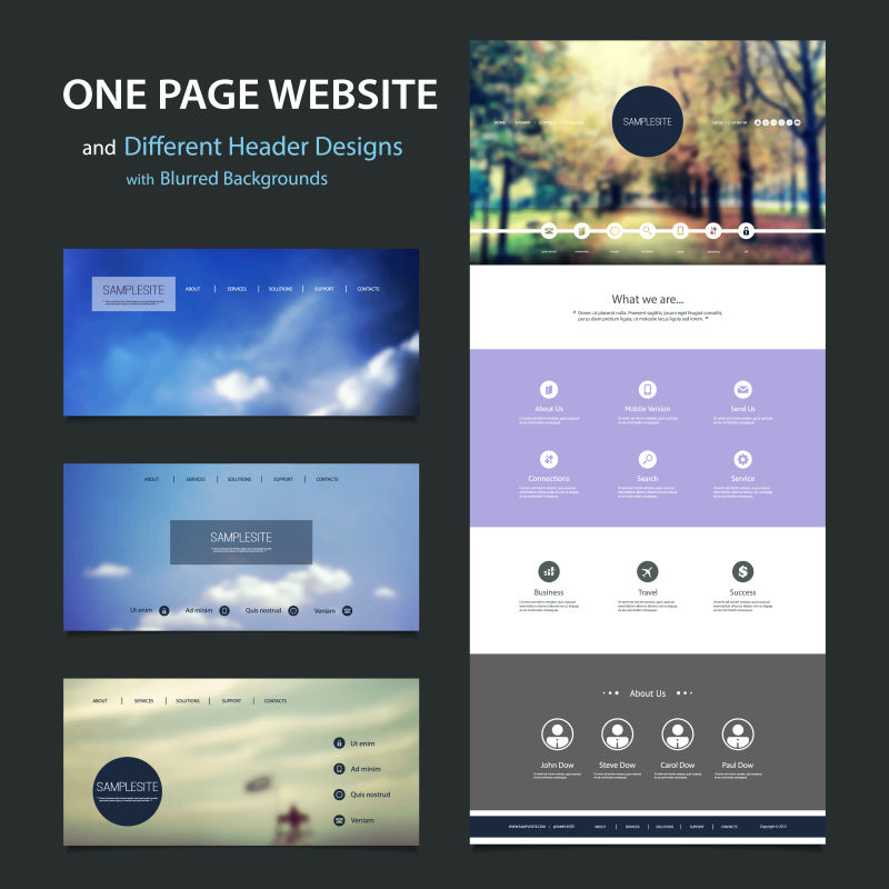
A responsive web design is one that adapts dynamically depending on the type of screen or device viewing it. There is only one website, not separate versions for desktop and mobile. Content remains readable, menus stay usable, and performance is predictable across all screens.
Responsiveness focuses on experiences instead of devices. The information looks consistent across devices, but the presentation adjusts to match each device.
Start With Clear Website Goals
Clarity is important before design begins.
Define the Purpose of Your Website
What does your website need to accomplish? Lead generation, e-commerce, information dissemination, or portfolio presentation? Having an end goal in mind will guide your design process.
Identify Your Target Audience
Understand how users access your site. Some may primarily use mobile devices, while others access it from desktops during work hours.
Determine the Essential Activities Users Must Perform
Identify key tasks like form submission, checkout, bookings, or reading content. A responsive design keeps these actions simple across all devices.
Designate a Mobile-First Strategy
Mobile-first planning enables better focus and usability.
Start Designing for Smaller Screens
Begin with the smallest display. Space constraints determine priorities. Key information comes first, with additional details in the background.
Larger Screen Layout Expansions
Once the mobile layout is optimized, expand the design horizontally for tablets and desktops while maintaining clarity.
The Bottom Line
Mobile-first planning prevents clutter and ensures essential elements are displayed clearly.
Responsive Wireframe Creation
Wireframes help visualize structure before development begins.
Wireframe Multiple Screen Sizes
Create wireframes for mobile, tablet, and desktop views to demonstrate content recomposition at different breakpoints.
Plan Layout Transitions
Determine column stacking, collapsing menus, and image resizing areas to avoid confusion during development.
Validate User Flow
Check how users transition from one section to another across screen sizes. Smooth experiences improve usability.
Use Flexible Layout Systems
Flexible designs are the foundation of responsive websites.
Use Fluid Grid Systems
Fluid grids use relative units rather than fixed units. Columns adjust according to screen size.
Avoid Fixed-Width Layouts
Fixed layouts break on smaller screens. Flexible layouts naturally prevent scrolling issues.
Use Spacing Consistently
Margins and padding adjust dynamically for readability and symmetry.
Optimize Typography for All Devices
Text readability impacts user experience.
Employ Scalable Font Sizes
Fonts change depending on screen size, remaining clear without zooming.
Control Line Length
Shorter lines improve readability on smaller screens.
Preserve Hierarchy
Headings and subheadings maintain a visual hierarchy, helping users scan content easily.
Make Touch-Friendly Interfaces
Mobile users interact via touch.
Increase Button and Link Size
Large tap targets reduce frustration on touch devices.
Add Space Between Elements
Proper spacing prevents accidental taps and improves ergonomics.
Replace Hover Actions
Hover interactions don’t work on touch devices. Use visible alternatives.
Build With Responsive Development Practices
Responsiveness depends on development quality.
Use Modern HTML & CSS
A clean structure allows flexible layouts. CSS handles changes through breakpoints.
Use Media Queries Correctly
Media queries target styles at specific screen sizes, based on content needs.
Utilize Flexible Images & Media
Images and media scale without disrupting layouts or causing overflow.
Testing for Responsiveness Across Devices
Testing ensures real-world functionality.
Test on Real Devices
Browser previews help, but testing on phones, tablets, and desktops is best.
Test Various Orientations
Ensure layouts work in both portrait and landscape modes.
Validate Performance
Slow loading impacts user experience and must be tested.
Accessibility in Responsive Design
Accessibility improves usability for all users.
Maintain Readable Contrast
Text remains readable across screen sizes.
Enable Text Resizing
Users can resize text without breaking the layout.
Organize Navigation Menus
Menus remain accessible and easy to navigate across devices.
Work with Skilled Designers and Developers
Team quality impacts performance.
Choose Experience With Responsive Projects
Experienced designers understand layout behavior and usability challenges.
Align Design and Development
Ensure design intent matches development output through effective communication.
Follow Structured Workflows
Structured processes reduce revisions and delays. Agencies like Medalla Website Development employ structured workflows for responsive solutions.
Maintain and Update Responsiveness Over Time
Responsiveness requires ongoing attention.
Update Information Carefully
New content must be compatible with responsive layouts.
Track Device Trends
Monitor changes in screen sizes and user behavior.
Resolve Problems Quickly
Faulty layouts harm trust. Periodic checks ensure consistent performance.
Common Mistakes to Avoid
Errors reduce responsiveness quality.
Disregarding Mobile Testing
Desktop-only testing leads to failures on mobile devices.
Overloaded Mobile Layouts
Too many elements overwhelm users and reduce focus.
Overuse of Fixed Elements
Sticky headers and footers decrease viewable space on small screens.